← KJ Vogelius
I’ve spent the past 5 years working at Klarna – a leading payment provider and bank.
I joined as a consultant in 2017 to work with rebranding the company.
Before long I took on my current role – design lead for payments, the foundational offerings at Klarna:
- Over 100 million active users pay with Klarna, for more than 2 million purchases per day.
- The payment products net over $1.2bn in annual revenue with 45% year over year growth during the past four years.
- The products are available in 20 markets and integrated by over 250 000 merchants.
Leadership in design can mean many different things and needs to evolve over time. A few thing I’ve focused on in this capacity have been:
- Leading & scaling the design team in payments from 3 to 28 people. It’s a highly skilled group, with a 50/50 gender split and 14 nationalities represented.
- I’ve contributed in setting up the broader design competence for success, while it’s grown from 15 to 140+ people.
- Pitch for, lead or otherwise contribute towards key initiatives and product launches through close collaboration with cross functional partners.
- Work to keep consistency, coherency and quality up across touch points and user journeys.
Below are a few examples* of things I’ve had a hand in launching.
* Full case studies available on request
Pay in 4.
Low friction part payments
Klarna initially struggled with traction in the US. The payment products weren’t fully resonating with users.
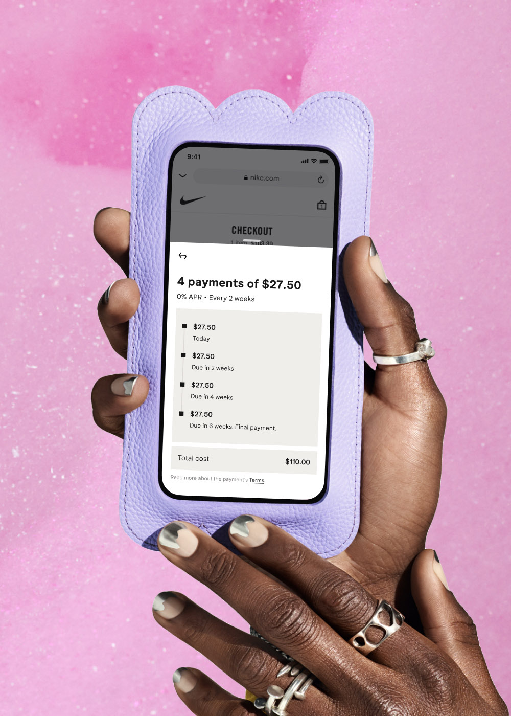
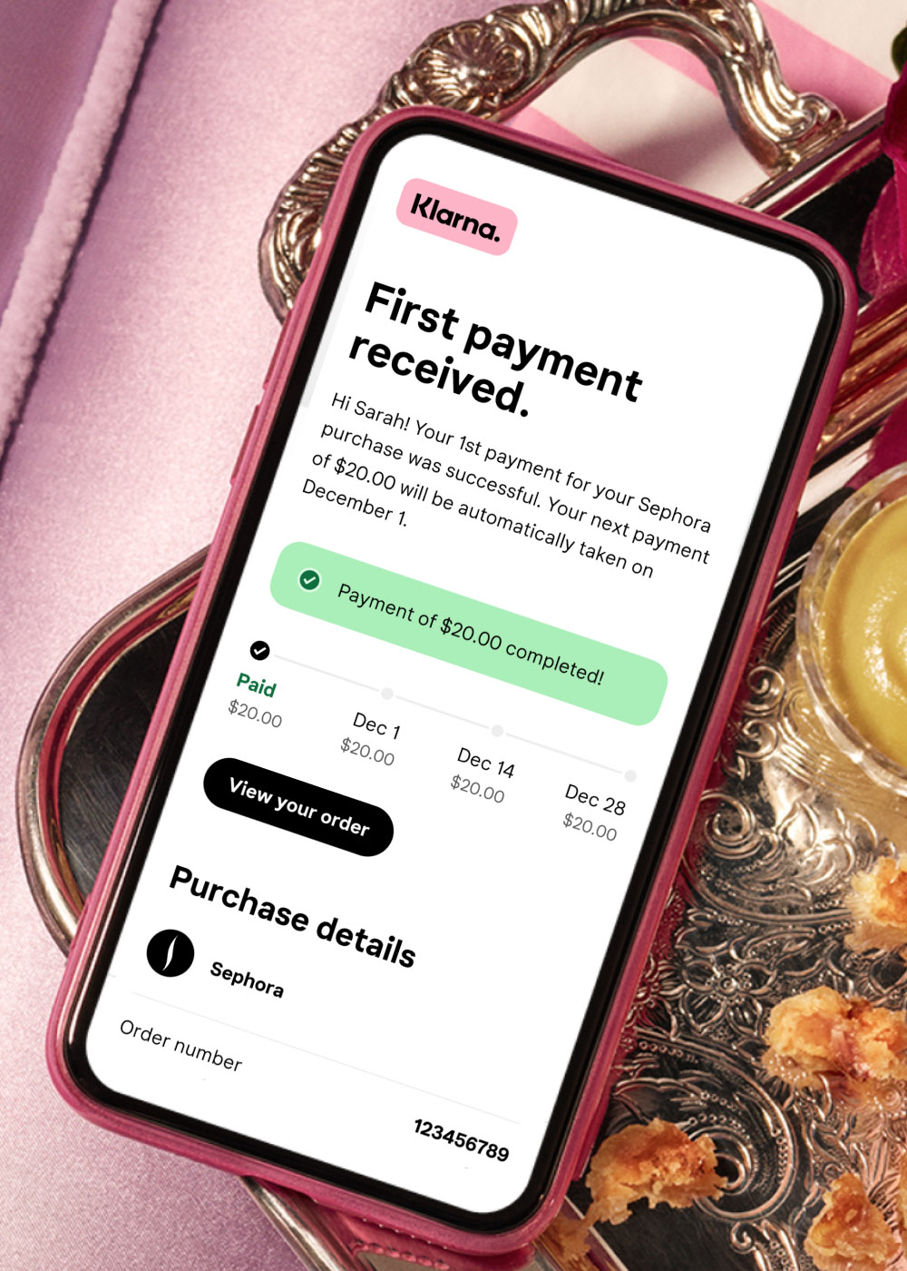
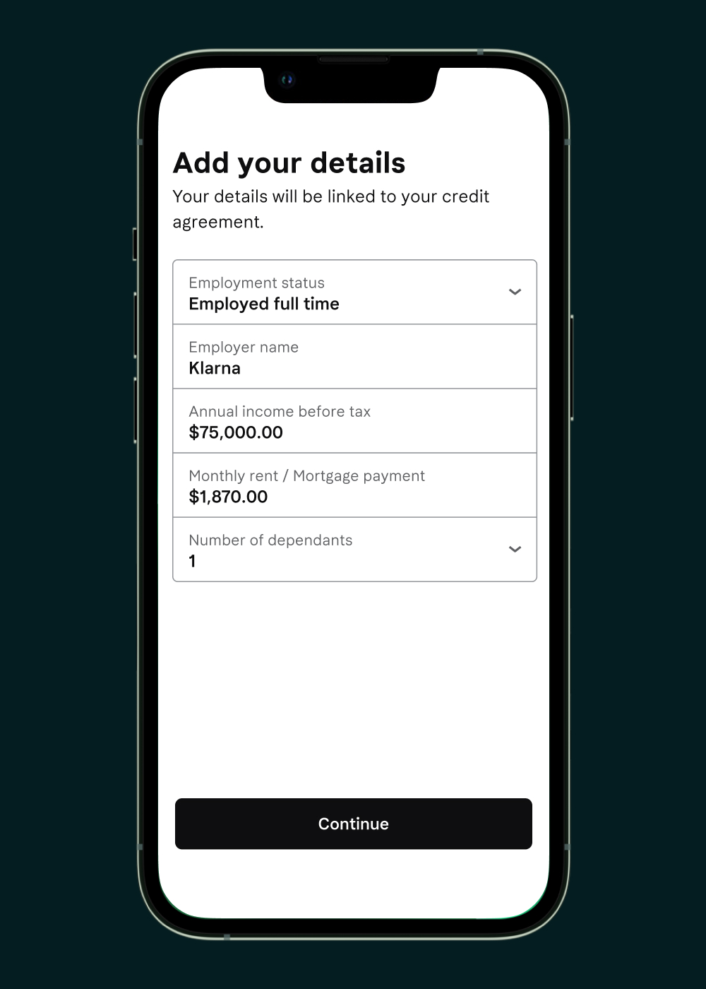
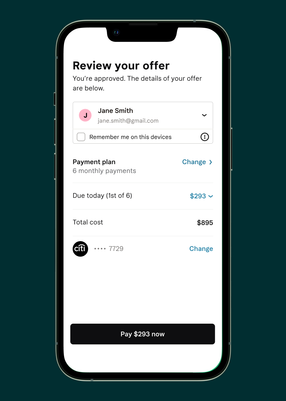
Pay in 4 is a new product, tailored for the preferences of US customers. It allows users to split payments in 4 interest free installments, debited automatically from their cards.
- I partnered with key stakeholders to spearhead a minimum viable product.
- Over the course of four years we’ve iterated on all aspects of the product, including for instance copy, presentation, user identification, payment plan communications, app features etc.
- Pay in 4 is now the main volume driver in the US as well as in 11 additional markets, driving over $600 million in monthly volume in the US alone.
- It’s been promoted in Klarna’s highest budget campaigns, e.g. the 2021 Super Bowl ad.
CO₂ tracker.
Making emissions understandable
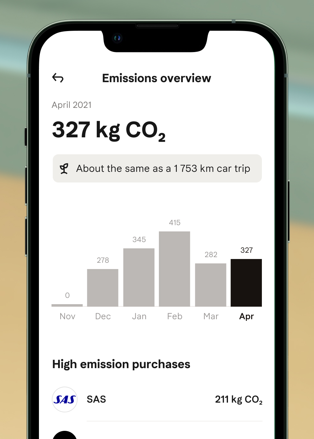
The CO₂ tracker is an in app feature that makes it easier to shop sustainably. By calculating and visualizing emissions they become more relatable.
We partnered with Doconomy, to get accurate CO₂ calculations, as well as Milkywire to make it simple to support impactful initiatives.
- I designed a first version of a per purchase CO₂ emissions tracker and brought it to market together with a small team.
- The tracker is accessed by 1.7 million users monthly on average.
- A dedicated team has been spun up to continuously evolve the feature.
To Pay.
Creating clarity & flexibility
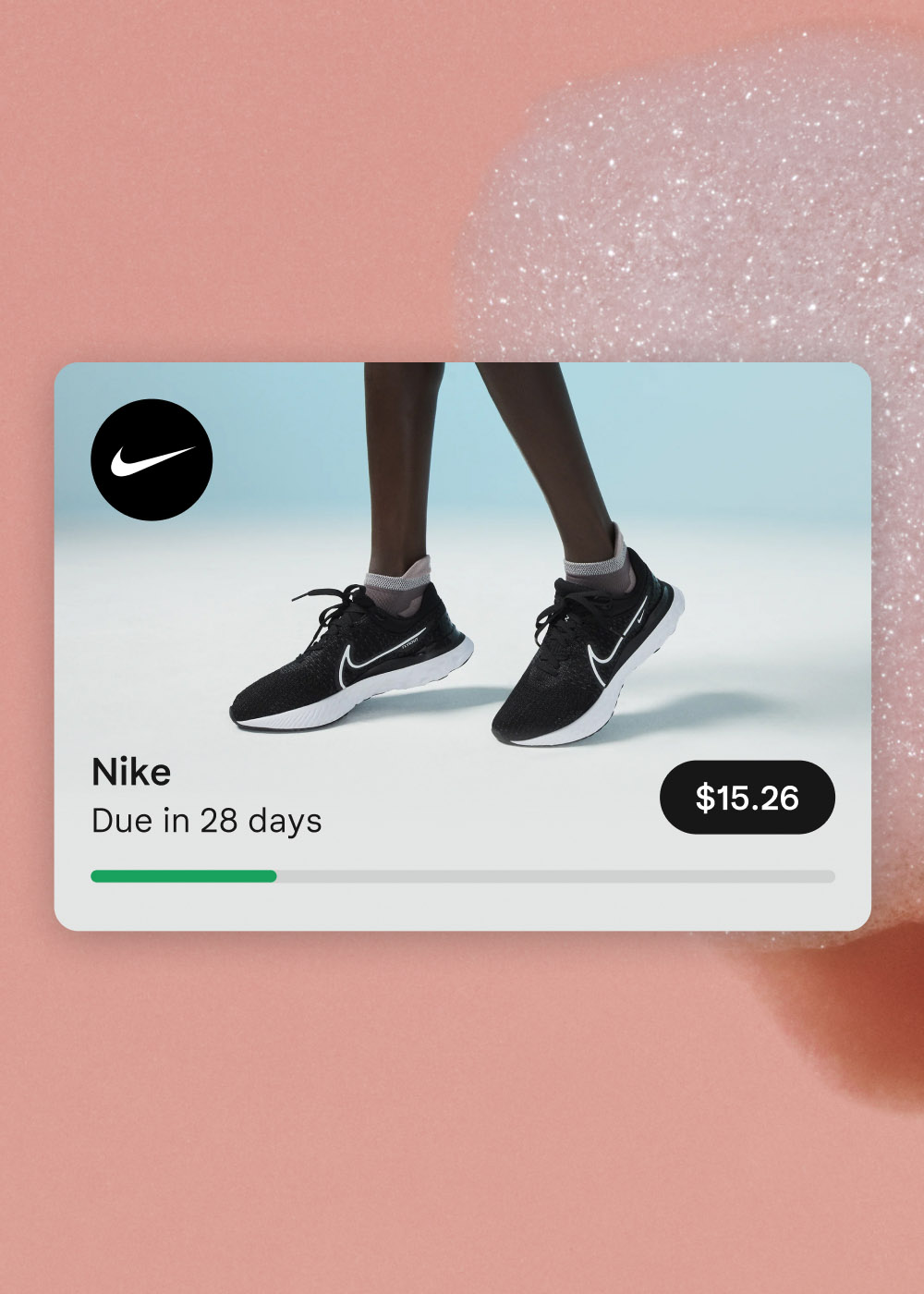
The To Pay view is where users of the Klarna app can see all payments that are due. From here they can take action and either pay, or change how to pay for a purchase. It’s a foundational set of features and one of the most commonly used views in the app.
- I designed the initial version of these features in close collaboration with a small team.
- During the past four years we’ve made continuous, iterative improvements and optimizations based on customer service errands, user research and analytics.
- Every month transactions exceeding one billion USD are managed through these views, with 400 000 unique payments or changes carried out every day.
Email Design System.
A solution for clear, global communication
Klarna’s users expect clear communications regarding their purchases. As a result we send over 30 million purchase and payments related emails every week.
We’ve recently created a full design system to ensure consistency and scalability as we move in to more markets.
- I lead the design work for a temporary team tasked with improving the emails.
- The new design system allows us to move from 800+ templates to just over 40, making feasible continuous optimizations and refinements.
- The design system supports features such as improved tracking, dark mode and non-latin character sets.
- A full time team has been spun up to be custodians of the email design system over time.
Financing 2.0.
Easier to understand installments
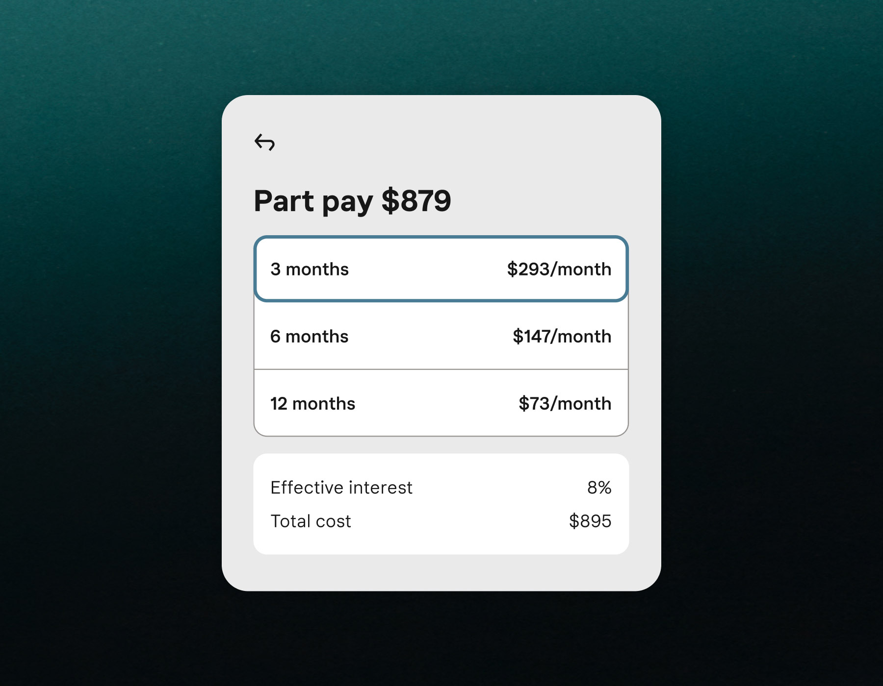
Klarna’s financing options offer great flexibility for our users. However, these products are often difficult to understand.
We created a new version that’s easier to comprehend and use. On the back end the new product also adds many features, making it more capable, secure and scalable.
- I worked with key stakeholders to define a minimum viable product.
- Through continuous iteration we’ve added features and refined functionality over the past two years.
- Financing drives over $150 million in volume per month.
- The new version drove an increase in volume by 18% in the first 4 months with an increase in conversion by 57%. Customer service errand rates dropped by 32% after launch.
Microgames.
Incentivising good behavior through fun
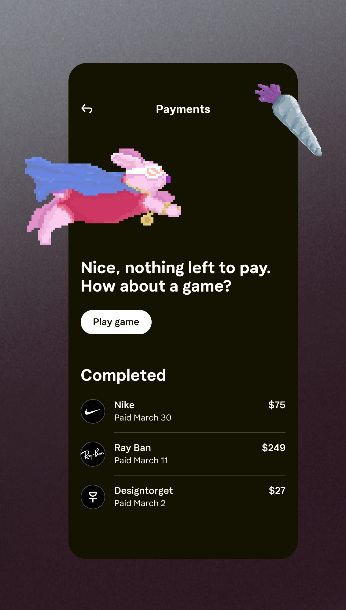
Even at Klarna we’re aware that settling your bills isn’t the most fun way to spend your time. Still, we wanted to make it as enjoyable as possible, while also rewarding responsible behavior in some way.
We created five little games that are playable in the app once you have paid all your bills.
- The games increased time spent in the app by 59%.
- One player spent 1421 minutes playing the games (19 minutes shy of a full 24 hours).
← KJ Vogelius
